Google Classroom
Google Classroom
GeoGebra
Classe GeoGebra
Se connecter
Chercher
Google Classroom
Google Classroom
GeoGebra
Classe GeoGebra
Contenu
SUNY - Stats
Interpreting Bar Graphs
Exploring a Cityscape Bar Graph
Creating Line Plots
Drawing Box-and-Whisker Plots
Creating Histograms from a Data Table About a Popcorn Party
Creating Scatter Plots
Interpreting Stem and Leaf Plots
Predicting Population Trends Based on a Sample Population
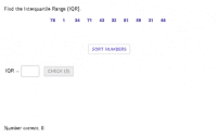
Finding the Interquartile Range
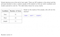
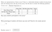
Interpreting Two-Way Tables
SUNY - Stats
Auteur :
MrValencia24
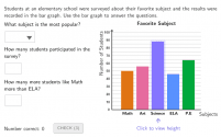
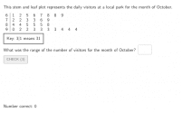
Interpreting Bar Graphs
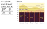
Exploring a Cityscape Bar Graph
Creating Line Plots
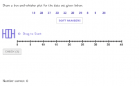
Drawing Box-and-Whisker Plots
Creating Histograms from a Data Table About a Popcorn Party
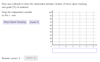
Creating Scatter Plots
Interpreting Stem and Leaf Plots
Predicting Population Trends Based on a Sample Population
Finding the Interquartile Range
Interpreting Two-Way Tables
Suivant
Interpreting Bar Graphs
Nouvelles ressources
Model sferyczny - sześcian-ośmiościan
Trefoil Knot
גיליון אלקטרוני להעלאת נתוני בעיה ויצירת גרף בהתאם
¿Quién llegará más lejos en el mundial?
רישום חופשי
Découvrir des ressources
centers of triangles
curvatura
What is the Exterior Angle Theorem?
Polynomial -3, 0, 4
LocusCircle
Découvrir des Thèmes
Théorie des Ensembles
Racine
Cylindre
Résumé Statistique
Triangles Scalènes